On Essay Rubrics, Why They are Hell, and How to Design Them Better
Rubrics are Hell.
Essay rubrics. Project rubrics. Oral presentation rubrics. As a social constructivist, I’ve always disliked them. But I can’t escape them.
We teachers are actually wedged between rubrics on both sides. We use them on our students’ work, to try and streamline the complex and demanding cognitive process of evaluation. And our administrators impose them on us, on our classroom environment, our lesson planning — for the same reasons. Evaluation is complex, demanding, hard to streamline.
When I worked at a large, regional public school (with a 40-strong English Department), the administrators adopted the Charlotte Danielson rubric.
Suddenly we all found ourselves hoping to earn a mark of “4.” The highest score, awarded to teachers whose classes seemed to run themselves — teachers who knew how to form clear objectives and motivate student-driven discussion and inquiry.
I knew how to play to the rubric, so I consistently scored “4.” I didn’t grow as a teacher. They left me to my devices.
But my colleagues — teachers I respected, teachers I had learned from — got lackluster “3s.” They were told “excellence” (as defined by Danielson), “was a place we sometimes visit, but no one lives there.”
We teachers don’t like being evaluated by rubrics. We don’t get anything out of it. We don’t get better at teaching. But we turn around and impose rubrics on our students. And we tell ourselves the students are supposed to use this “feedback” to get better at writing. Or projects, critical thinking, or whatever.
To my mind, this goes beyond irony, or even hypocrisy. Rubrics are a kind of Kafkaesque bureaucracy in miniature, a little hell we create for ourselves and our students without knowing why or how.
The Rubrics Aren’t to Blame, Per Se.
When I complained about five-paragraph essays in a previous post, a reader astutely pointed something out to me. I was perhaps focusing on the wrong culprit. Guns don’t kill people, as they say.
Rubrics, like five-paragraph essays, aren’t the source of the problem. Both are proximate causes to ineffective instruction.
But they don’t have to be. And I’m not here to separate the sheep from the goats. I’ve been a bad teacher plenty of times in my career.
So let’s not blame the rubric for the hell we’ve built for ourselves. Let’s build a better rubric.
The first step is to identify the problem. What is a rubric, anyway? And in what ways can a rubric go wrong?
The Analytic Rating Scale.
Here’s a rubric. Well, an ur-rubric. A rubric avatar. A symbol of a rubric. Whatever you want to call it.
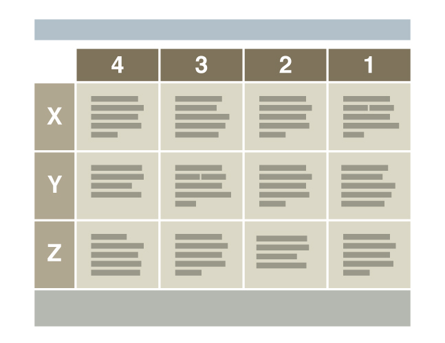
Technically, this graphic represents a specific type of grading rubric, an Analytic Rating Scale. In my experience, this is the form of rubric that sees the most use. In fact, I haven’t seen many essay rubrics that aren’t analytical rating scales.
The columns (4, 3, 2, 1) represent the scale. Mastery to total failure, and all the shades between. Most rubrics I’ve seen (and written) start on the left with the highest score or grade. Sometimes the scale is your typical letter grade scale — A through F. In my career, I’ve used various numeric scales, such as the 9-point AP Language and Composition essay scoring scale, or 4-point scales based on the rubrics published by AAC&U.
The rows (X, Y, and Z) represent three criteria which the assessor weights equally. For example, I’ve seen a lot of essay rubrics with rows labeled “Thesis,” “Support,” and “Organization.” The point is, the teacher analyzes the complex task they gave the student — an essay — into its constituent sub-tasks.
Well, maybe.
Sometimes not. I’ve seen some weird row labels on essay rubrics. For instance, sometimes the criteria are, stupidly, “Introduction,” “Body,” “Conclusion.” As if the skills required to produce these types of paragraphs were discrete. If you are good at introductions, chances are you’re good at body paragraphs and conclusions. If you’re bad at one, chances are you’re bad at the others.
I’ll be fair. Analyzing a complex task like writing an essay is difficult. Even for the teacher who assigned the task. Plenty of times, I’ve asked students to write something, and then had a devil of a time figuring out what criteria I wanted to assess it on.
A Key Problem with ARS Essay Rubrics.
So actually, defining the criteria is a built-in problem. Analytic Rating Scales are supposed to help us evaluate more quickly, more fairly, more objectively. But there’s a lot of room for error and inaccuracy when we sit down and ask ourselves, “so…what criteria can I analyze out of the task, to then evaluate responses to the task?”
The whole process has the air of a tiger chasing its tail.
Often, we construct the criteria after the essays have been written. Heck, sometimes teachers even look at the essay of the class leader — the kid who always turns in solid gold — and constructs the rubric from it. I’ll be the first to confess. I’ve done this. It’s no good. It perpetuates achievement gaps.
So, should we construct the criteria before the students even write a word? That seems more fair. But to do so is to judge an abstract product in our own heads. Writing a rubric around abstractions, and then applying it to the evaluation of actual, messy, diverse student writing — is it fair? Sure. It reminds me of a bumper sticker: I’m not prejudiced. I hate everyone equally.
Let’s Get Philosophical for a Minute.
This problem of defining criteria isn’t a problem with rubrics, per se, but a symptom of lazy epistemology.
Let’s call this set of beliefs Sloppy Positivism.
Positivism says we can only know a Capital-T Truth through induction, after the fact. The positivist puts no faith in deduction, and calls something true only if the empirical evidence supports it.
Essay rubrics are supposed to pull the evaluation of writing into the realm of the objective. A rubric is supposed to be a step toward empiricism. It’s supposed to reduce the complex reality of a student’s cognitive work and expression into a series of discrete, observable realities.
However, in my experience, teachers don’t work inductively when writing rubrics. This is the “sloppy” part of Sloppy Positivism.
The language of the rubric behaves as though it describes general, positivist truths about student writing. Truths like “All successful essays state their key claim at the end of the first paragraph.” The rubric assumes the teacher can use these truths as benchmarks to assess actual student writing.
But in practice, the language in column 1 of a given rubric winds up describing an abstract “successful essay.” An a priori, Platonic essay that has no business in an a posteriori positivist framework.
I’ve never in my career seen a classroom rubric actually built a posteriori, from sampled data derived from all responses to the prompt. In other words, I’ve never seen an analytical rating scale that lives up to the positivist philosophy supposedly behind it.
The slipperiness of criteria is a key philosophical problem underlying Analytical Rating Scale rubrics. Subjectivity and bias are pretty much inescapable, sure, but we could at least work from a consistent epistemological framework. I don’t think that’s too much to ask.
I think we can do better.
Some Additional Problems with Rubrics.
All right. Say you’ve got your epistemology sorted. For sake of argument.
Well, there are still plenty more pitfalls. But I’ll just focus on three major problems here, with particular emphasis on the third.
ARS rubrics are deficit based.
As a social constructivist, I believe any instruction that comes from the basis of deficit — of a lack in the students that needs to be “filled” or corrected — is fundamentally flawed. So here’s the thing: teachers tend to write rubrics in a certain order. We usually start by describing a successful essay or project. Then, we fill in the other columns by chipping away at the success — imagining the possible deficits. There ends up being little room for all the divergent ways students productively, beautifully fail — and these failures, fertile moments in their diversity and opportunity, are wasted. Let me try that again, in other words: students always find ways to fail off-script. And these supremely teachable moments sift right through the cracks of our rubrics.
ARS rubrics are written for the wrong audience.
Who does a teacher have in mind when writing a rubric? When we describe the successes, in column 1, maybe we imagine we are praising the top kids, who we know will probably be demonstrating successful work. But they don’t need our praise. And the rest of the rubric? I don’t know about other teachers, but I find myself writing on the defensive. I write for a hostile, combative audience. A student or parent who doesn’t understand why, despite their efforts, I have evilly, arbitrarily given the essay a B+. A rubric ends up having more kinship with a legal disclaimer than with constructive criticism. Finally, sometimes we teachers find ourselves writing rubrics with entirely the wrong audience in mind: administrators, who want things formatted in a certain way, and whom the rubric will not ultimately effect in any way.
ARS rubrics are poorly designed.
This one’s the biggie. Because, say you’ve avoided all the other problems. Say you’ve got a perfect rubric, the kind that can change a kid’s life for the better. You can still botch it with bad design. The typical ARS rubric is an impenetrable wall of text — a table of cells that your average student is going to have trouble navigating. Where’s the important information? Where do you start? Most students just look at the grade, and maybe the holistic comments scrawled in the leftover space under the grid. The rest of the rubric might as well be in cuneiform.
The Basics of Design.
As I said, I want to focus on that last problem in particular. Bad design. Arguably, design is the aspect of rubrics we pay the least attention to. Despite it being the most important aspect. If we want our rubrics to truly be instructional tools — documents that help students make plans and decisions about how to improve their work — we need to design them to that end. But we almost never do.
So what should we do? Study design. Good rubric design begins with a basic understanding of graphic design principles. Let’s look at three principles, for starters:
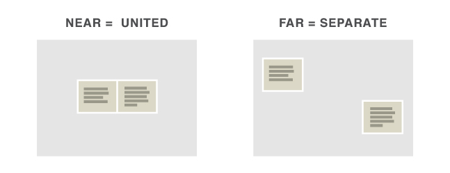
- Proximity. Nearness implies unity or connection. Farness implies separateness or disconnection.
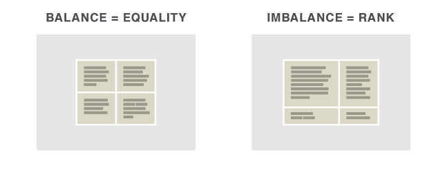
- Proportion. Relative size implies relative importance: bigger is more important, smaller is less important. Another way to say this: imbalance implies rank, balance implies equality.
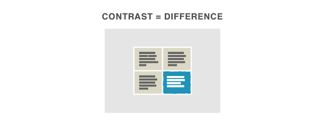
- Contrast. contrast in size, shape, color, texture, etc. implies distinction or opposition of ideas.
Use Design Basics to Create Hierarchy and Metaphor.
Working from these three principles can help you create hierarchy and metaphor. I’m hoping to show you how hierarchy and metaphor can help a student navigate, comprehend, and make use of a rubric.
Hierarchy is the clear communication of relationships within a document. What’s the most important idea? The second most important idea? What do you want a reader or viewer to take away from your document at a glance?
I first learned about document design and visual hierarchy when I learned how to put together a resume. Your name should be large, your headings medium (proportion). You group information based on similarity (proximity). And you use sans serif for headings, serif for body text (contrast). Basic stuff that blew my mind at the time.
Metaphor, or more generally, analogical thinking, is how we use what we already grasp to clarify what we don’t. We learn new ideas by comparing them to things we already understand. For example, I used the word “grasp” two sentences ago — something physical we do with our hands — as a metaphor for the more abstract action, “comprehend.” Metaphors ground the abstract in the concrete.
Foundational metaphors are already at work in the basic graphic design principles I mentioned. Size is importance, for example. Nearness is affinity. Up is good, down is bad.
Metaphorical Muddiness in the Grid Layout.
So, while it’s natural to construct a graphic design around metaphors, it’s also easy to muddy the message with too many metaphors. And I think this is exactly why the grid layout of the average rubric is impenetrable. Because the grid ambiguously suggests several possible metaphors. Let’s consider a couple:
- Nearness is affinity. In a grid, there’s vertical nearness, and horizontal nearness. Two metaphors, then, occupying the same space: above or below is similar, and to the left or right is similar. When two systems of nearness are overlapping over a series of elements (table cells) that are all the same size and shape, the graphic impact of proximity is flattened. Reading a table means constantly consulting the dimensions of the framework — What column am I in? What row? — which is a very different user experience than the ease of access that graphic design tries to achieve.
- Up is good, down is bad. The top row might represent success. But then, if the numbers of the columns increase in value (go up) from right to left, then left is good, right is bad. Some rubrics go the other way: right is good. So, spatially, there are too many ambiguities for the student to grasp the basic value statements of the graphic at a glance.
So Let’s Design Better Rubrics, Already.
Cheers if you made it this far.
You’re ready to think beyond the ARS grid. You’re looking for solutions.
Well, I think a good place to start is a verb. A verb that sums up the kind of cognitive work you’re asking the student to do.
So, let’s start with the verb aiming.
It works well for certain types of assignments. Assignments where the objective is clear. Assignments which recognize and value the potential for productive, repeated failure. We want students to aim before they throw a mental dart — but we recognize that they’ll have to throw a few darts, or a lot of darts, before they can consistently hit the bull’s eye.
So there’s our metaphor: the bull’s eye.
Let’s imagine a rubric built on this metaphor:
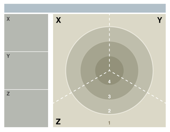
See that bull’s eye? That’s what you’re aiming at, if you’re the student. You want your darts to land in the center. The darker colors at the center draw the eye, reinforcing this message. The rating scale (1, 2, 3, 4) correlates to the rings of the bull’s eye, and includes the possibility of missing the target.
Unlike a grid, the concentric circles have a single, definite meaning when it comes to proximity. The overarching metaphor is nearness to the center is accuracy.
I’ve also done my best to design all the rubric elements so that their grouping and size communicate their relationship and importance.
The Bull’s Eye Rubric, Applied.
Here’s what a bull’s-eye rubric might look like, filled out for a student who’s done some notes analyzing a painting for an art history class:
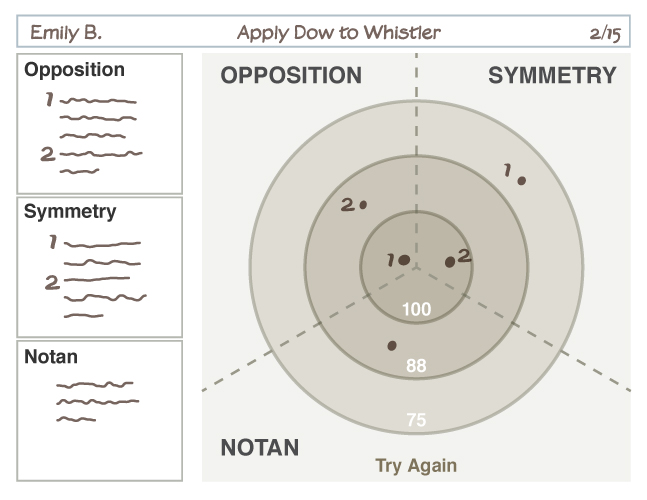
The teacher has imagined the student’s attempts as darts landing with more or less accuracy, and then used the space provided to explain. Notice there are no generalized descriptions of different success levels, as you’d find in the cells of your standard ARS. Instead, this rubric assumes you are willing to write, oh, six or seven brief sentences per student.
I’m not trying to moralize. Nah. I’m always looking to streamline my grading. But the thing is, writing those ARS descriptions — here’s what a “3” in “thesis statement” looks like — is inefficient. A waste of instructional effort, because students don’t use them to make decisions about their writing. So, writing a few sentences that describe why the student’s darts are landing where they are seems a much better investment of time.
The darts-and-bull’s-eye metaphor also suggests something else. Something subtle, yet very important to the student. There’s a wide range of ways to fail, and that failure is part of the process of getting better. I don’t know about you, but when I play darts, every bad throw just makes me want to take aim again.
Variations on the Bull’s Eye.
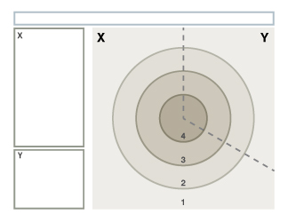
Like our earlier ARS grid, this rubric seeks to evaluate the student work based on three criteria: X, Y, and Z. One way to represent that, then, is to divide up the bull’seye into thirds. Another way is to set up three bull’s eyes:
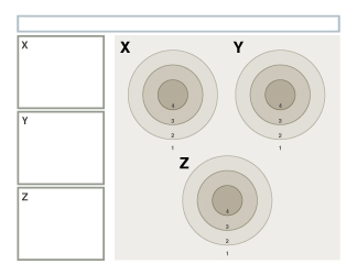
It may be helpful to visualize other variations. So, here you go.
You could vary the number of criteria. Four, for example:
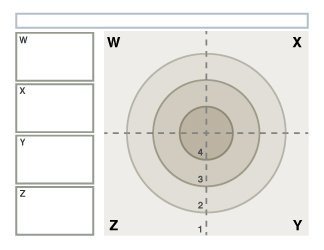
You could have criteria with different weight:
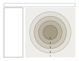
Or, you could vary your rating scale. Five levels, for instance:
Let’s Keep Going.
I hope I’ve convinced you that aiming, and the bull’s-eye metaphor, have the potential to do two things. First, to help you conceptualize a clearer assessment framework. And second, to communicate that framework more clearly to your students.
But aiming is just the beginning. Not all essays or projects are about taking aim and chucking mental darts.
So, here are some other verbs to think about:
- Climbing
- Building
- Diving
- Evolving
- Floating
- Distilling
Each of those verbs are metaphors for the kinds of cognitive work you might want your students to do. And they all suggest rubric layouts that lend themselves to clear visual hierarchy.
Do you want to design better essay rubrics? Better project rubrics? Would you like a PDF chock-full of ideas for how to design them?
Because I’d absolutely love to give you one. But I need to put it together. I suspect I’ll have that done in a week or so.
Here’s what I suggest: sign up for my newsletter. You’ll get emails when I post new articles. You’ll also get a link to a free resource I made: “Designing Your Writing.” And of course, you’ll be the first to know when “Better Rubrics Through Metaphor” is available!