The Golden Ratio: So Obvious, So Amazing
The Wow Gap.
Somewhere, I heard that what’s obvious to you is amazing to someone else. And the saying stuck with me. See, as a teacher, I’m in the business of explaining stuff, and it’s easy to get jaded about something you’ve explained a hundred times. We teachers should resist getting jaded though.
The same is true for designers. I design, too, and sometimes I’m lucky enough to explain something to a client that wows them. Something that was obvious, maybe not even worth mentioning, from my perspective.
Actually, this happened just the other day. While I was talking to a client about the spacing of two elements on his website, I experienced this effect — let’s call it the Wow Gap.
I showed him a grid based on the Golden Ratio, overlaid on his website layout. And I explained how if we nudged some text over, the proportions would be more harmonious.
“How did you learn that?” He wanted to know. It was hard for me to say. The Golden Ratio is just engrained in my design process. It’s a go-to tool for analyzing spatial arrangements. Obvious to me, amazing to him.
Designing with the Golden Ratio
Since I’ve been chewing on that conversation, I thought I might try to document the process. To explain one way I use the Golden Ratio when designing. In case it helps you, or someone else, have a wow moment.
A little while ago, I worked out a redesigned banner for the website of my graphic novel in progress. I knew I wanted to include the coat of arms of the Free City of Danzig, since that’s an important setting in the book. However, I didn’t want to just cut-and-paste any of the available versions. I wanted to create my own, and I wanted it to match the bold, minimal look of the font, Avenir Next Heavy.
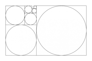
So, I turned to the Golden Ratio – 1:1.618. I started with a rectangle 1000 pixels high and 1618 pixels wide. Then, inside it, I constructed a series of squares and circles with size relationships based in that ratio.
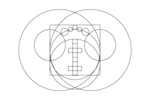
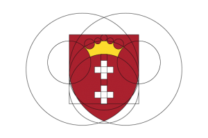
 Then, copy-pasting circles and squares from this set, I arranged them to recreate the coat of arms.
And the final result is pretty clean. I’m happy with the proportions, and with the unique, geometric take on the crown.
Did I Wow You?
Maybe not. It’s not the most impressive logo design. The point, though, is the process. When faced with a design problem, the golden ratio is an awesome tool to have in your kit. I hope I’ve shown you that.
For graphic designers, designing with a grid, or with a set of pre-selected elements — it’s obvious. The Golden Ratio is in pretty much every art or design or architecture textbook you can find. But maybe you’re not a designer, and it’s amazing to you. (Like it was to my web design client.)
And if you’re a teacher (like most readers of this blog), there’s something else you can take away from this.
Explaining something that’s obvious should never be a chore. There’s always a part of our brain that’s going to say “Duh!” when someone asks something like, “how did you know how to do that?” But in explaining something obvious to us, we are explaining something amazing, even mind-blowing to someone else.


2 Replies to “The Golden Ratio: So Obvious, So Amazing”
“How did you learn that?”
https://www.youtube.com/watch?v=fwYfuJfIgaw
Yes